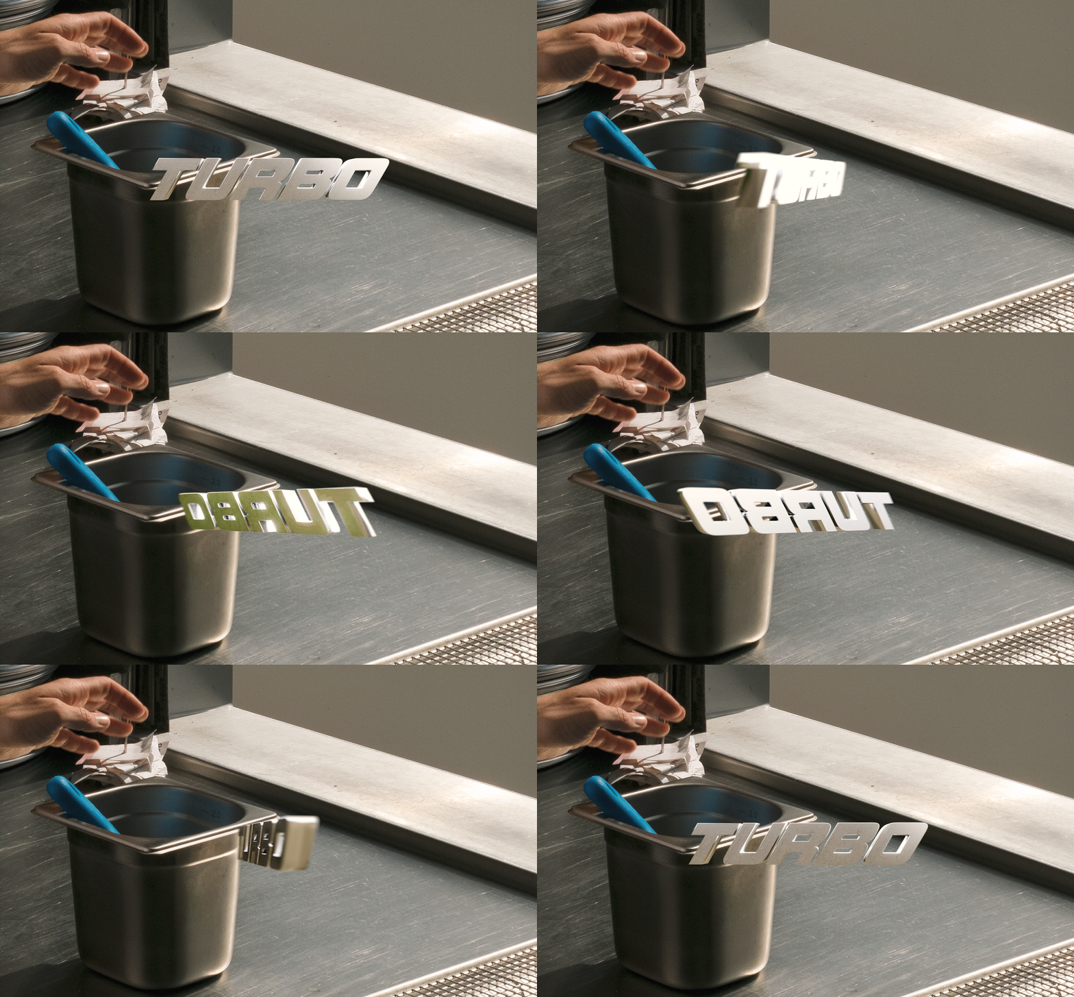
Turbo Pizza
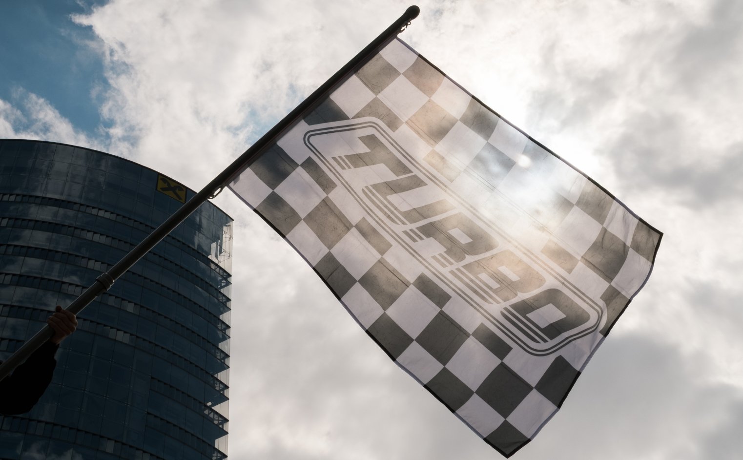
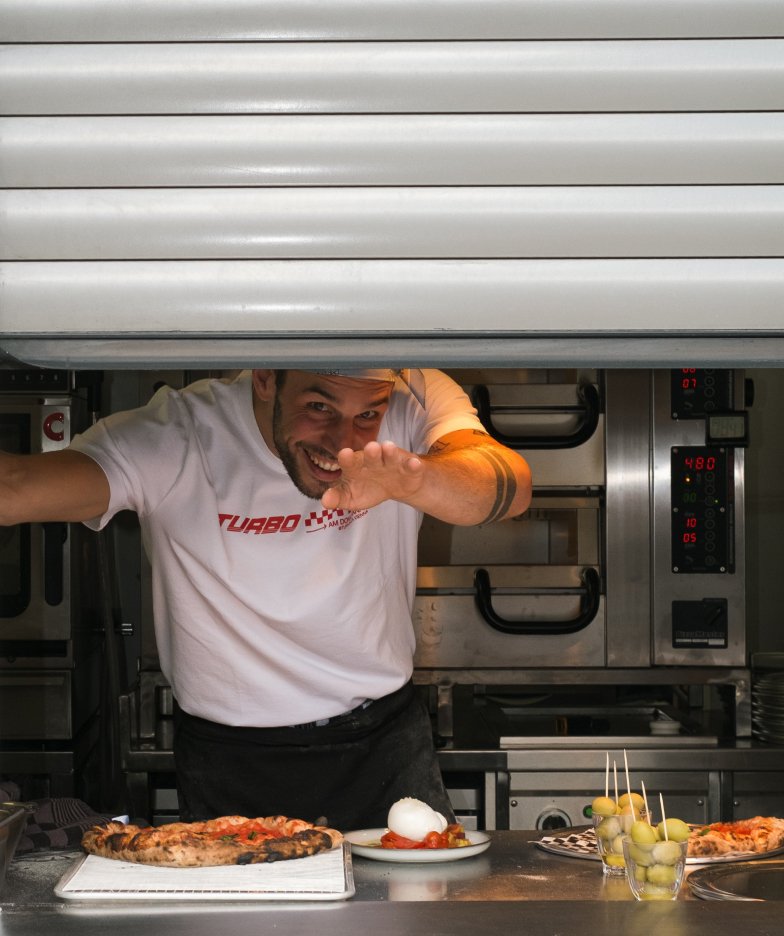
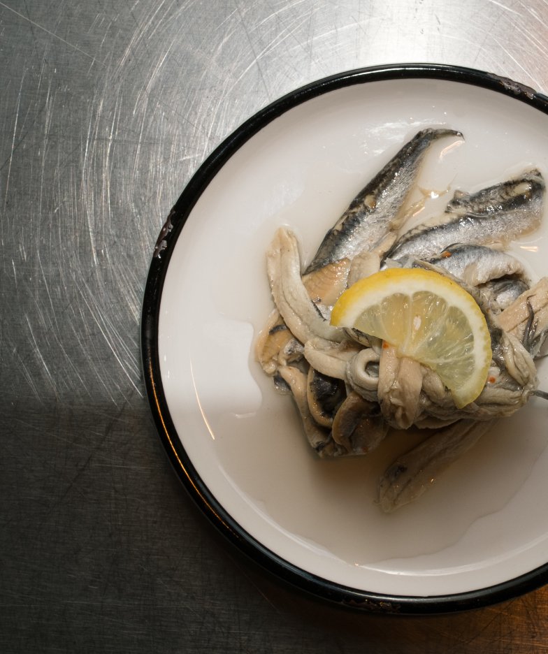
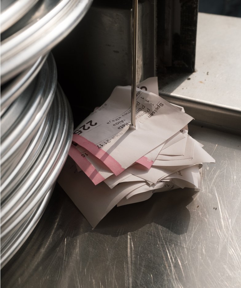
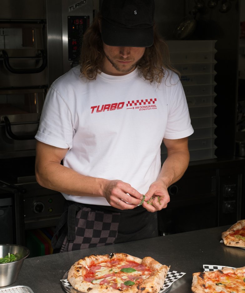
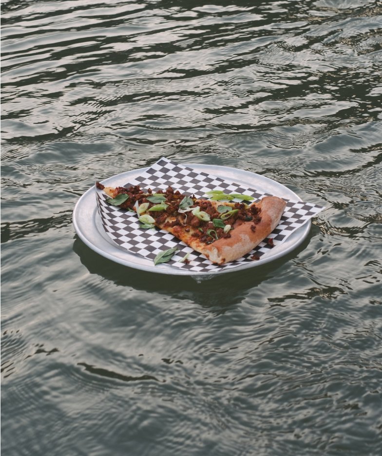
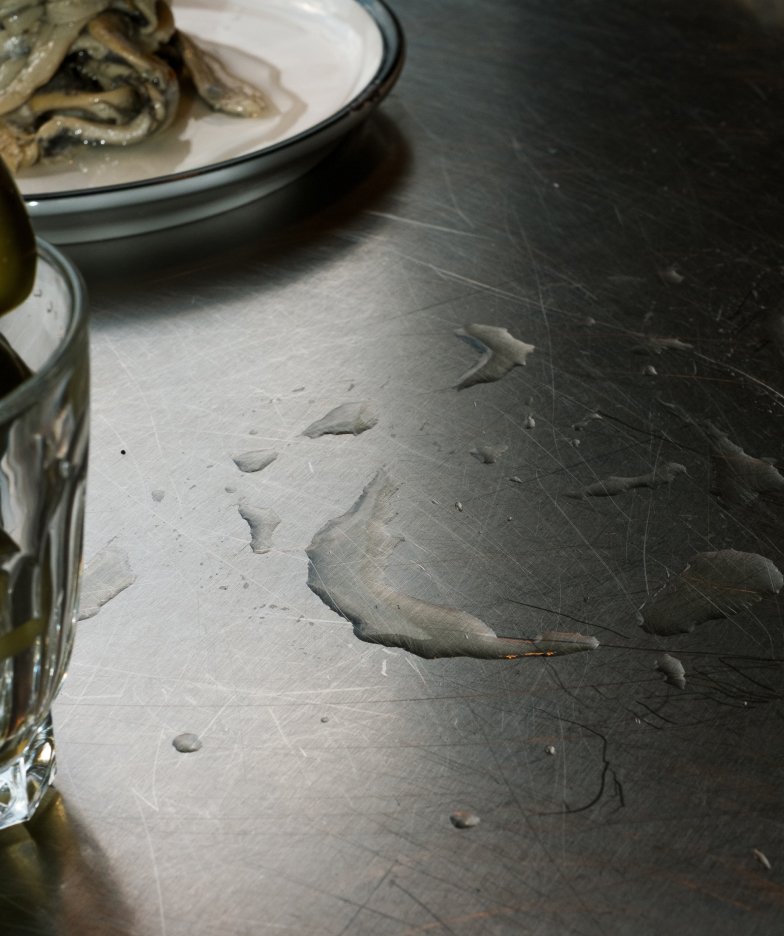
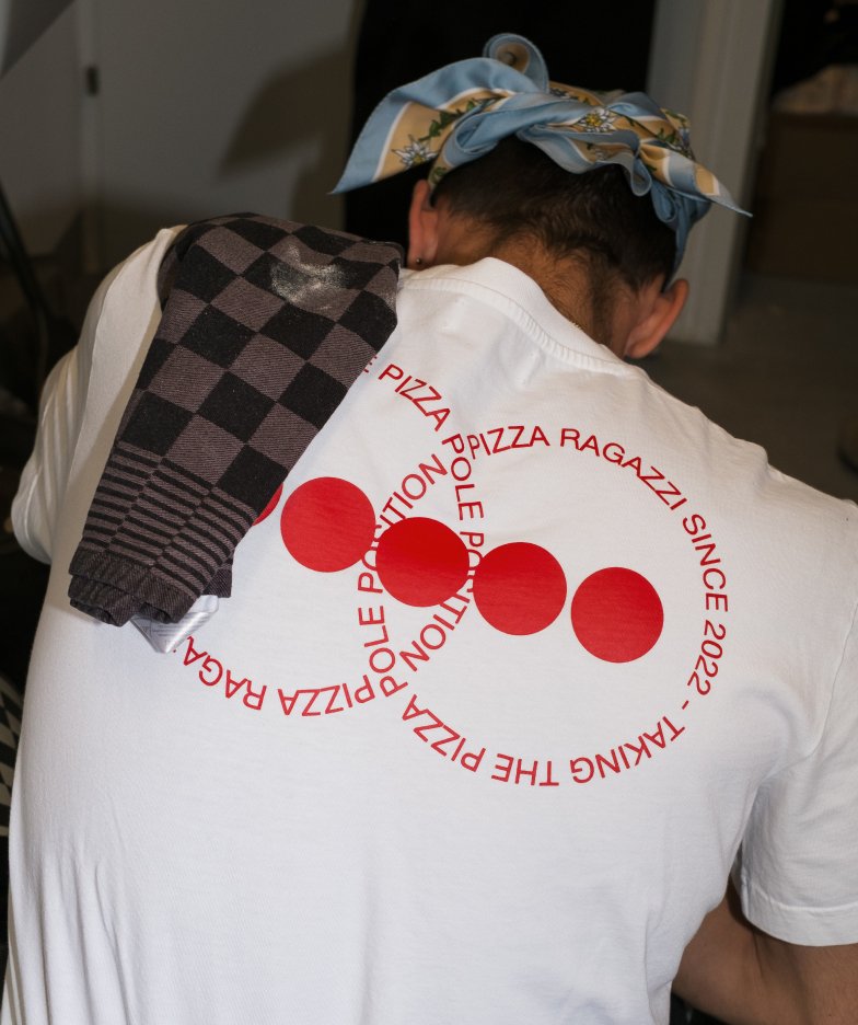
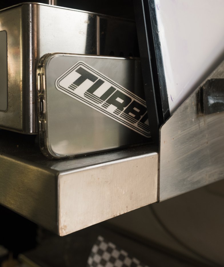
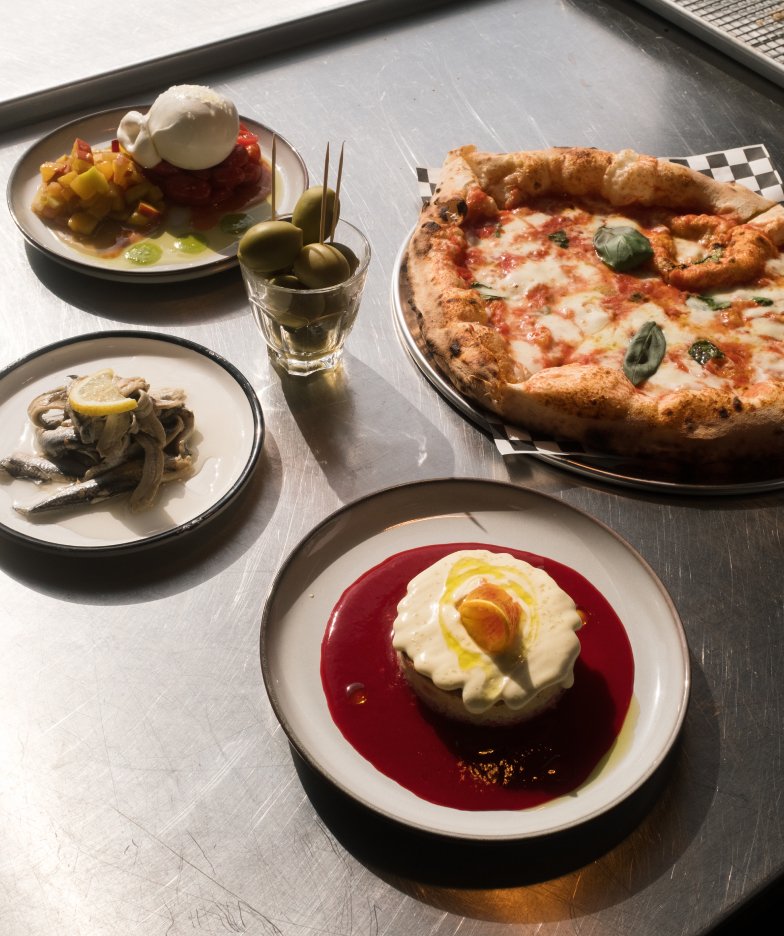
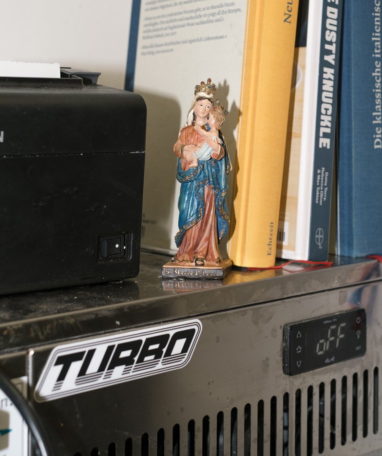
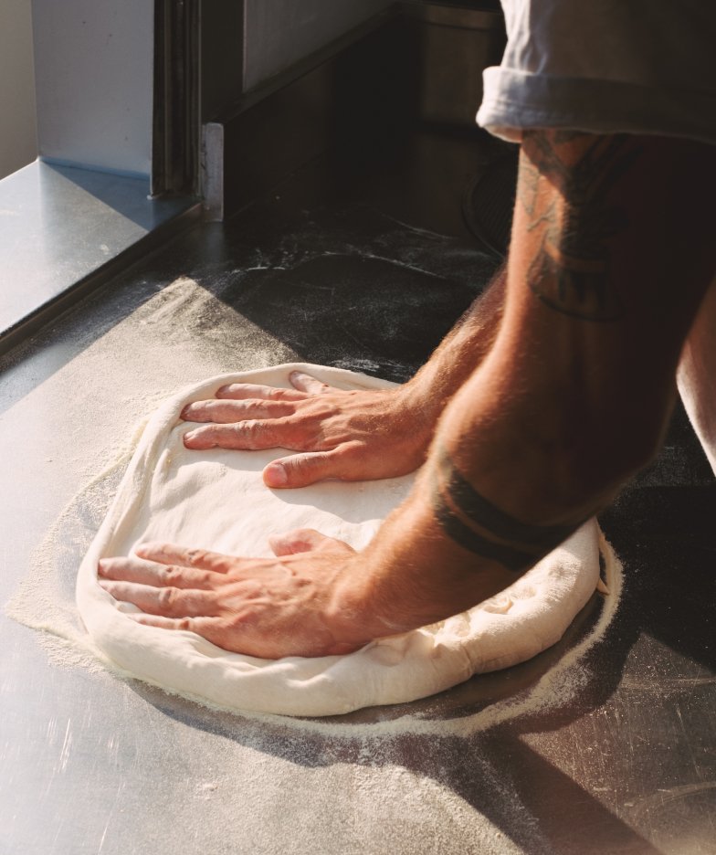
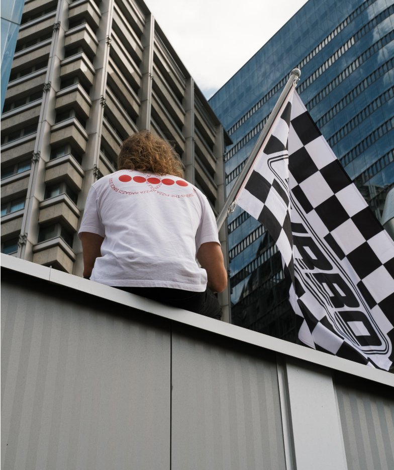
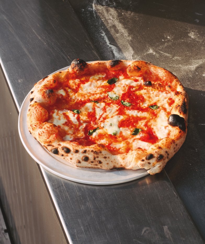
For Turbo Pizza, we developed a visual language that stems directly from the brand’s core. Instead of perfect food aesthetics, the focus is on authentic moments, textures, and movement. The result is a visual identity that exudes confidence, builds brand recognition, and consistently conveys the brand’s distinctive character.
The Idea
The starting point for the project was not to develop a new visual identity, but to sharpen what already defines Turbo Pizza. Together, we defined the brand’s core more precisely, uncovered its character, and formulated a clear design philosophy. The goal was not to reinvent the brand, but to make its identity visible and give it a consistent visual expression.
The Concept
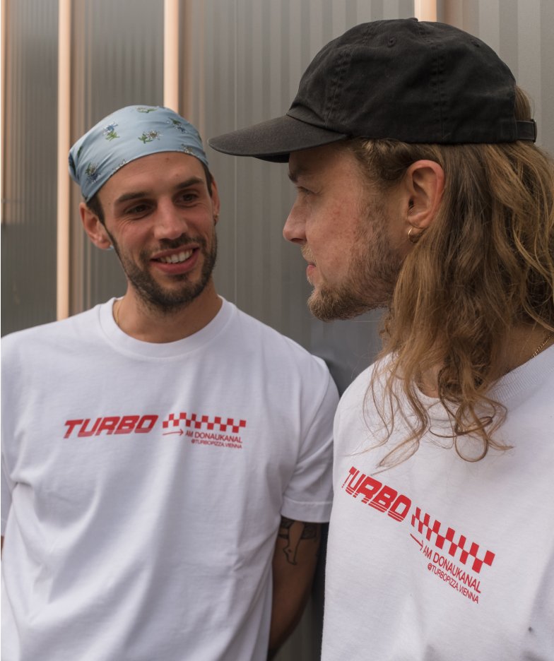
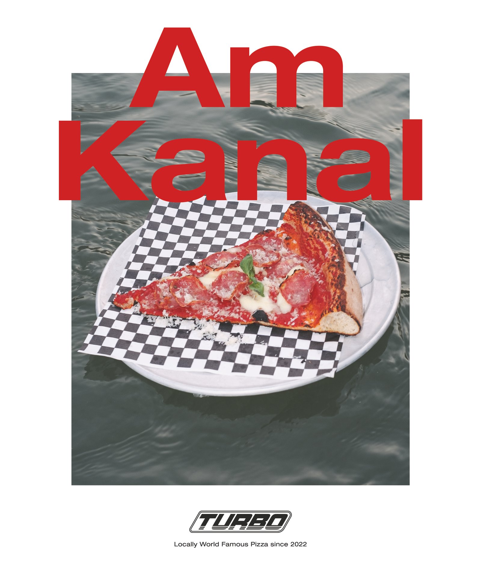
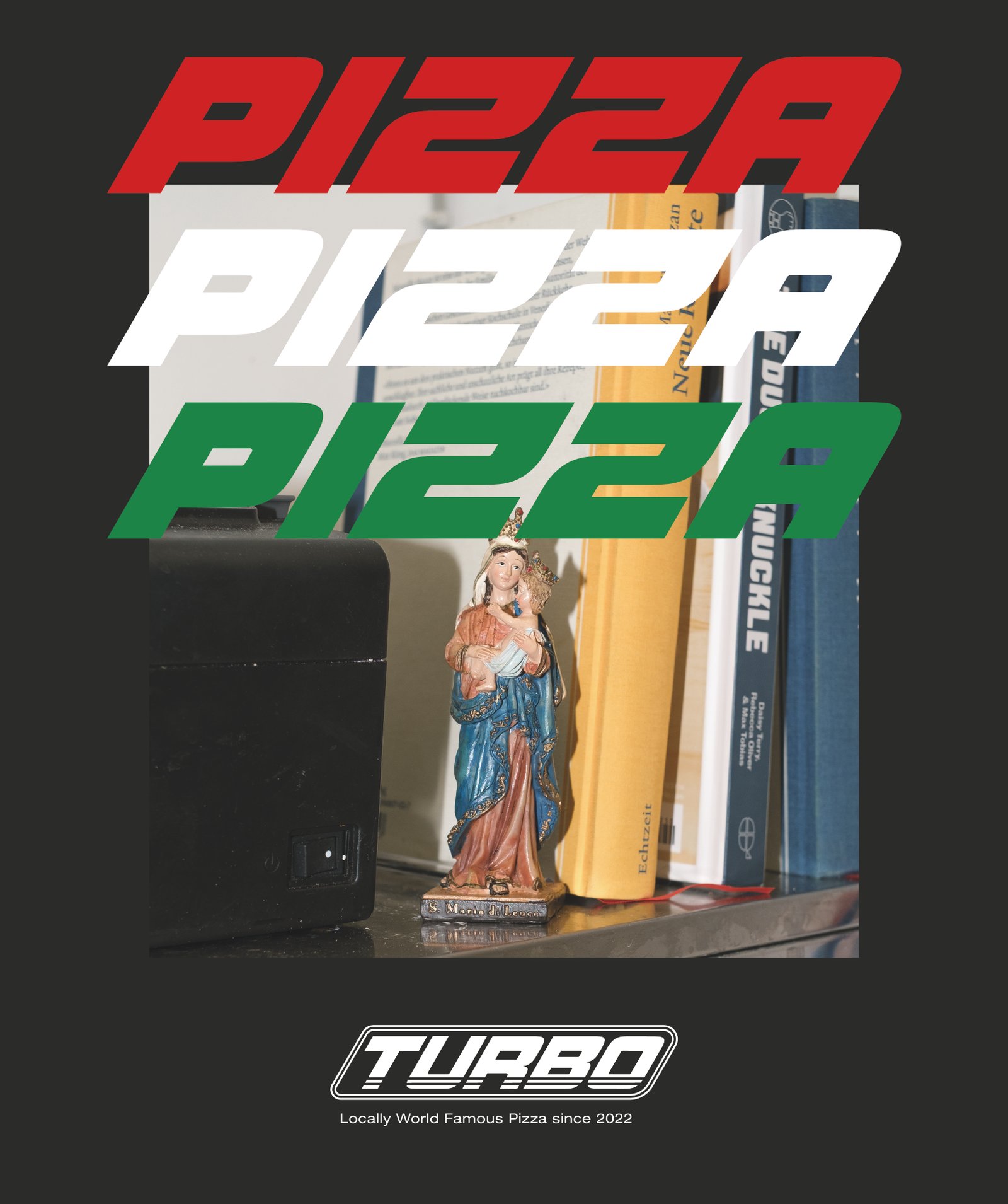
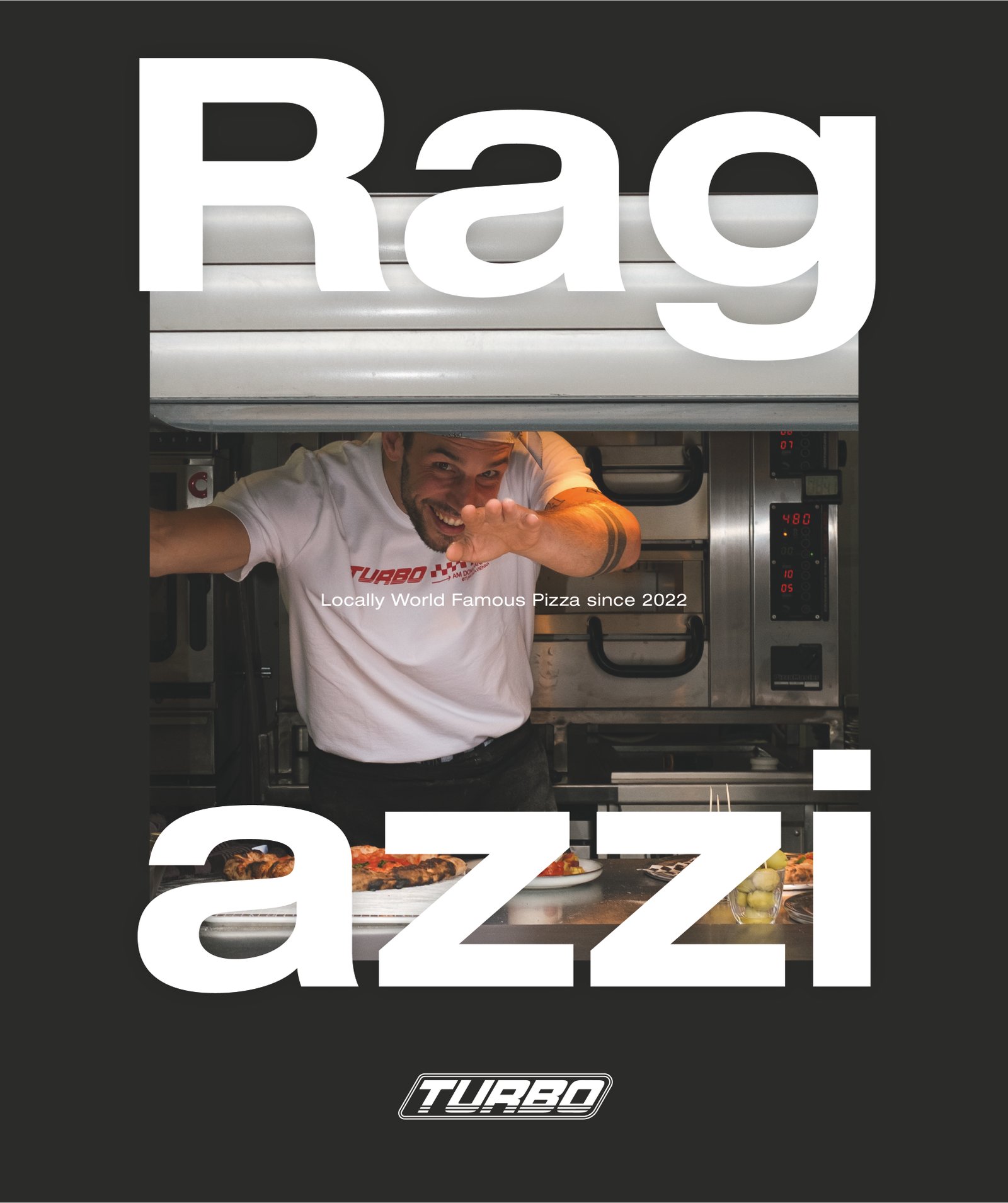
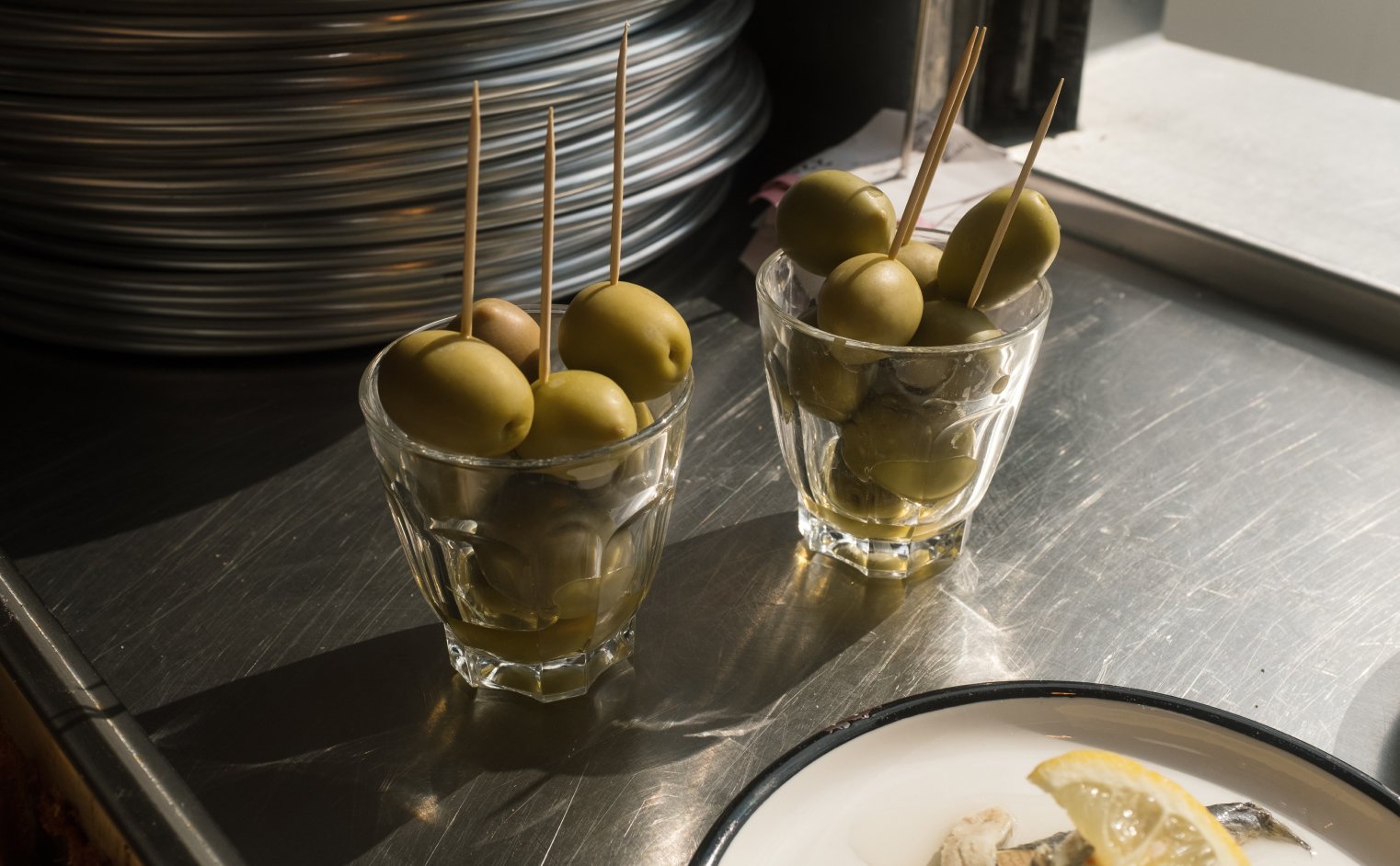
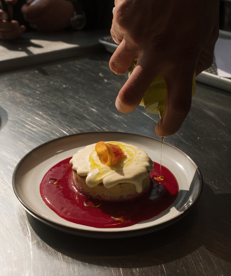
The photography doesn’t follow a staged ideal, but rather the rhythm of the brand itself. Moving away from perfect food aesthetics toward a visual world that conveys closeness, energy, and authenticity. Hands, textures, movement, and spontaneous moments take center stage. They tell a story not just about pizza, but about the controlled chaos, speed, and directness that define Turbo Pizza.
Implementation
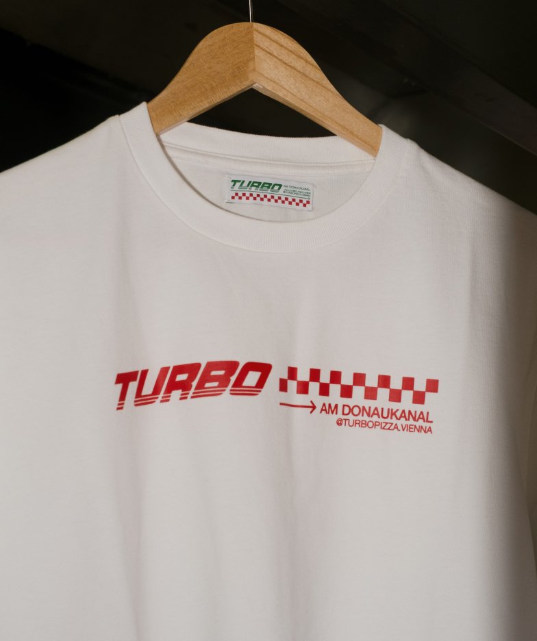
The result is a consistent visual identity in which art direction and photography blend seamlessly. Direct. Raw. Confident. A visual language that doesn’t need to be explained—it simply works and consistently conveys the brand’s character across all channels.