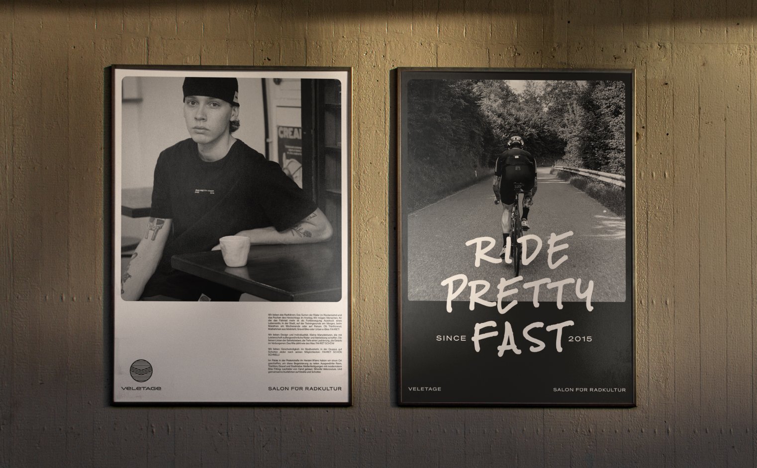
Veletage – 10th Anniversary
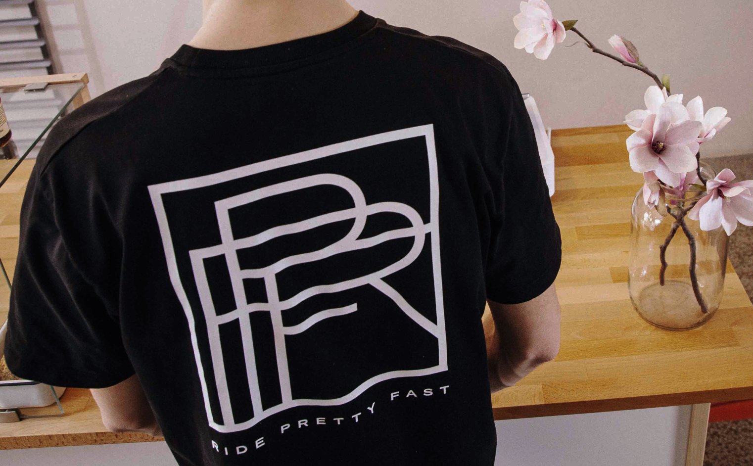
Veletage views cycling as a culture. The brand combines high-quality products, craftsmanship, and spatial design to create a place where design, performance, and community come together naturally. To mark our tenth anniversary, we designed a limited-edition T-shirt that translates this philosophy into a minimalist graphic design and showcases the brand’s identity beyond the world of cycling.
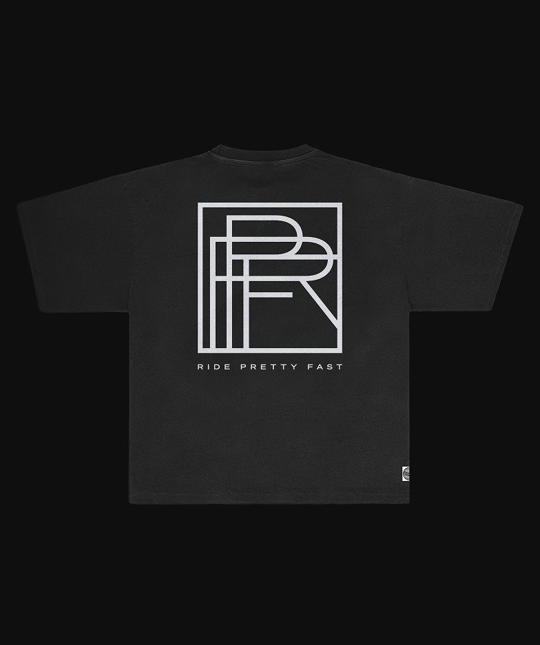
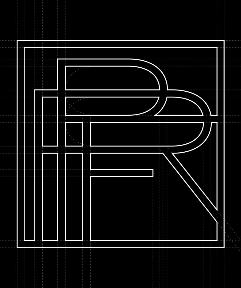
Making Posture Visible
The starting point for the project was not the design of an anniversary T-shirt, but rather the question of how Veletage’s ethos could be translated into a graphic design. A brand that extends far beyond cycling and blends community, design, and craftsmanship into a distinct identity. This idea gave rise to a minimalist graphic concept that transforms the slogan “Ride Pretty Fast” into a striking monogram. Inspired by the clean lines of Art Nouveau, the logo combines tradition with a contemporary design language, creating a distinctive symbol for the tenth-anniversary celebration.
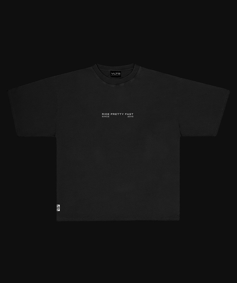
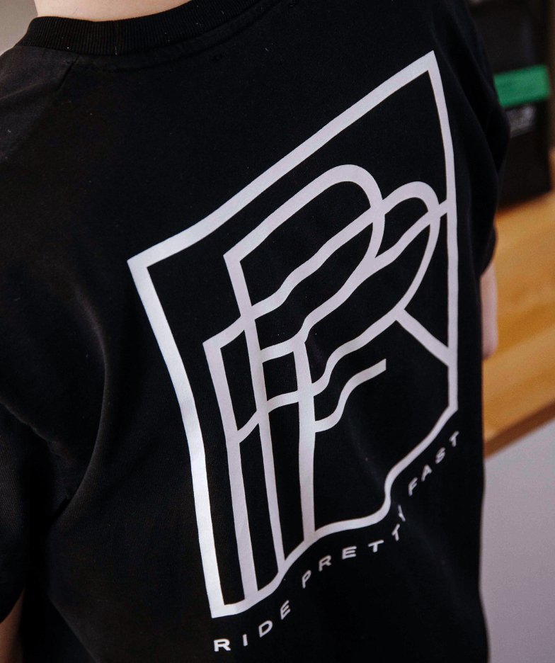
Identity in Action
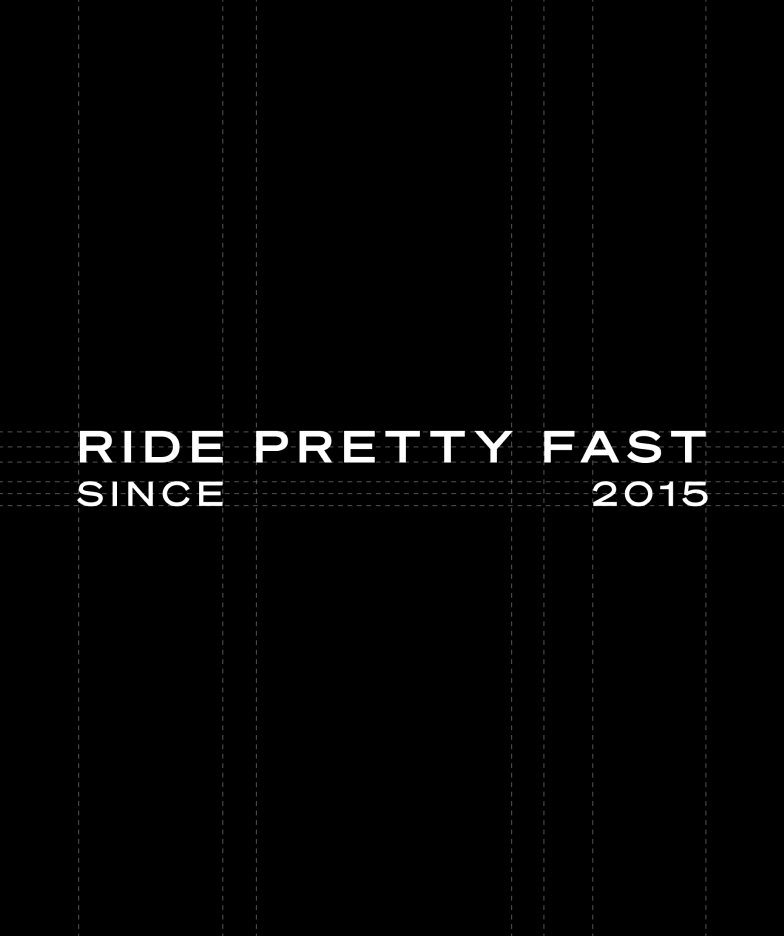
Complemented by a deliberately understated typographic design on the front, the result is a timeless garment that conveys Veletage’s identity beyond the world of cycling. The result is more than just a merchandise item. It is an object that brings the brand's values to life, strengthens community, and carries the spirit of Veletage into everyday life. Exactly. On sale. Timeless.